March 19, 2026
When MultiChildLayoutDelegate is not enough
Aloïs Deniel

If you've been working with Flutter long enough, chances are you've run into a layout that Row, Column, and Stack just can't handle cleanly. That's when most of us reach for CustomMultiChildLayout and its MultiChildLayoutDelegate.
I wrote about this approach in a previous article — and honestly, for many cases, it works great. You get full control over how children are sized and positioned.
But there's one thing it fundamentally cannot do: size the parent based on its children.
The limitation of MultiChildLayoutDelegate
Let's look at the signature of the key method:
@override
void performLayout(Size size) {
  // `size` is the parent's size — already decided for you.
}
See the problem? By the time performLayout is called, the parent's size is already determined. You receive it as a parameter. You can layout and position children within that box, but you can't say "actually, I need to be 200px tall because that's what my children require."
This is fine when your layout fills all the available space — like a toolbar that stretches across the screen. But what about layouts where the parent should wrap its content?
Think about a component like a custom tooltip, a chip with an icon and label, or a card header where the height depends on the tallest child. With MultiChildLayoutDelegate, you're stuck: you have to hardcode a height, or wrap everything in extra IntrinsicHeight hacks that defeat the purpose.
Enter SlottedMultiChildRenderObjectWidget
Flutter has a lesser-known widget hiding in the framework: SlottedMultiChildRenderObjectWidget. It's actually used internally by widgets like Chip and InputDecorator — so you've been benefiting from it without knowing.
Unlike CustomMultiChildLayout, this approach gives you a full custom RenderBox. That means you implement performLayout at the render object level, where you decide the parent's final size.
The concept is simple: instead of identifying children with arbitrary LayoutIds, you define typed slots. Each slot represents a specific child in your layout.
Let's build a concrete example: a card with an overlapping edge tag — the kind of component you'd see on a product card ("NEW", "SALE", "PRO") or a notification badge that straddles the top edge.
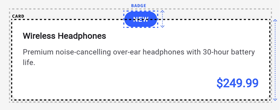
The tag sits centered on the top edge of the card, overlapping it by half its height. The parent widget must account for this overhang in its own size — otherwise surrounding widgets would overlap the tag.
Why can't standard widgets handle this?
StackwithClip.nonewould let the tag visually overflow, but the parent's reported size wouldn't include the overhang. Widgets above the card would overlap the tag.- Adding a top
PaddingorSizedBoxto compensate requires knowing the tag's height at build time — but it depends on the font size, text scale factor, and padding, which you don't control. Columnwould stack the tag above the card, but it wouldn't overlap — you'd lose the straddling effect.
The core problem is that the parent's own geometry depends on a child's measured size. You need to measure the tag, compute half its height, and use that to offset the card body and size the parent. That feedback from child measurement to parent sizing is exactly what standard composition can't express.
Step 1: Define the slots
Two slots: the tag that straddles the edge, and the body content below it.
enum _TaggedSlot {
  tag,
  body,
}
Step 2: Create the widget
The widget accepts the two children. The card's visual appearance (background, rounded corners) is handled by the body child itself — for example, by wrapping it in a Container with a BoxDecoration. The render object only handles layout and positioning.
class Tagged extends SlottedMultiChildRenderObjectWidget<_TaggedSlot, RenderBox> {
  const Tagged({
    super.key,
    required this.tag,
    required this.body,
  });

  final Widget tag;
  final Widget body;

  @override
  Iterable<_TaggedSlot> get slots => _TaggedSlot.values;

  @override
  Widget? childForSlot(_TaggedSlot slot) {
    return switch (slot) {
      _TaggedSlot.tag => tag,
      _TaggedSlot.body => body,
    };
  }

  @override
  _RenderTagged createRenderObject(BuildContext context) {
    return _RenderTagged();
  }
}
Step 3: Create the render object
This is where the magic happens. The render object measures the tag first, uses half its height as the overhang, then positions the card body below it. Since the body is a regular widget (like a Container), it handles its own visual appearance — the render object only deals with layout and paint order.
class _RenderTagged extends RenderBox
    with SlottedContainerRenderObjectMixin<_TaggedSlot, RenderBox> {
  _RenderTagged();

  @override
  void performLayout() {
    final tag = childForSlot(_TaggedSlot.tag);
    final body = childForSlot(_TaggedSlot.body);

    // 1. Measure the tag to know its height.
    tag?.layout(constraints.loosen(), parentUsesSize: true);
    final tagSize = tag?.size ?? Size.zero;
    final overhang = tagSize.height / 2;

    // 2. Layout the body below the overhang.
    body?.layout(
      constraints.deflate(EdgeInsets.only(top: overhang)),
      parentUsesSize: true,
    );
    final bodySize = body?.size ?? Size.zero;

    // 3. Size the parent to contain both.
    size = constraints.constrain(Size(
      bodySize.width,
      overhang + bodySize.height,
    ));

    // 4. Position children.
    final tagParentData = tag?.parentData as BoxParentData?;
    tagParentData?.offset = Offset(
      (size.width - tagSize.width) / 2, // centered horizontally
      0,
    );

    final bodyParentData = body?.parentData as BoxParentData?;
    bodyParentData?.offset = Offset(0, overhang);
  }

  void _paintChildForSlot(
    _TaggedSlot slot,
    PaintingContext context,
    Offset offset,
  ) {
    final child = childForSlot(slot);
    if (child == null) return;
    final parentData = child.parentData! as BoxParentData;
    context.paintChild(child, offset + parentData.offset);
  }

  @override
  void paint(PaintingContext context, Offset offset) {
    // Paint the body first (behind), then the tag (in front).
    _paintChildForSlot(_TaggedSlot.body, context, offset);
    _paintChildForSlot(_TaggedSlot.tag, context, offset);
  }

  bool _hitTestChild(
    _TaggedSlot slot,
    BoxHitTestResult result,
    Offset position,
  ) {
    final child = childForSlot(slot);
    if (child == null) return false;
    final parentData = child.parentData! as BoxParentData;
    return result.addWithPaintOffset(
      offset: parentData.offset,
      position: position,
      hitTest: (result, transformed) => child.hitTest(result, position: transformed),
    );
  }

  @override
  bool hitTestChildren(BoxHitTestResult result, {required Offset position}) {
    // Hit-test the tag first (on top), then the body.
    return _hitTestChild(_TaggedSlot.tag, result, position) ||
        _hitTestChild(_TaggedSlot.body, result, position);
  }
}
Look at how the overhang flows through the entire layout. The tag's measured height determines the body's vertical offset and the parent's total height. Every one of these values is derived from measuring the tag child — something that's only possible when you control the full layout protocol.
Notice that we also have full control over the draw order. By painting the body before the tag, we ensure the tag always renders on top of the card surface — regardless of the order the slots are defined in. With MultiChildLayoutDelegate, children are painted in the order they appear in the child list, and you have no way to change that. Here, you decide exactly what gets drawn first.
By delegating the card's visual appearance to the body child (a Container with a BoxDecoration), the render object stays focused on what only it can do: measuring, positioning, and controlling paint order. The styling is handled by the widget tree, where it's easy to customize per card.
Using it
With the widget ready, using it is straightforward. Each card gets a tag and a body — the layout handles the rest. The body is wrapped in a Container that provides the card's visual appearance (background color, rounded corners).
Tagged(
  tag: Container(
    padding: const EdgeInsets.symmetric(horizontal: 16, vertical: 6),
    decoration: BoxDecoration(
      color: const Color(0xFF315EFE),
      borderRadius: BorderRadius.circular(20),
    ),
    child: const Text(
      'NEW',
      style: TextStyle(
        color: Colors.white,
        fontWeight: FontWeight.bold,
        fontSize: 12,
      ),
    ),
  ),
  body: Container(
    decoration: BoxDecoration(
      color: Colors.white,
      borderRadius: BorderRadius.circular(12),
    ),
    padding: const EdgeInsets.fromLTRB(20, 20, 20, 16),
    child: Column(
      crossAxisAlignment: CrossAxisAlignment.start,
      mainAxisSize: MainAxisSize.min,
      children: [
        Text('Wireless Headphones', style: theme.textTheme.titleMedium),
        const SizedBox(height: 8),
        Text('Premium noise-cancelling over-ear headphones.'),
      ],
    ),
  ),
)
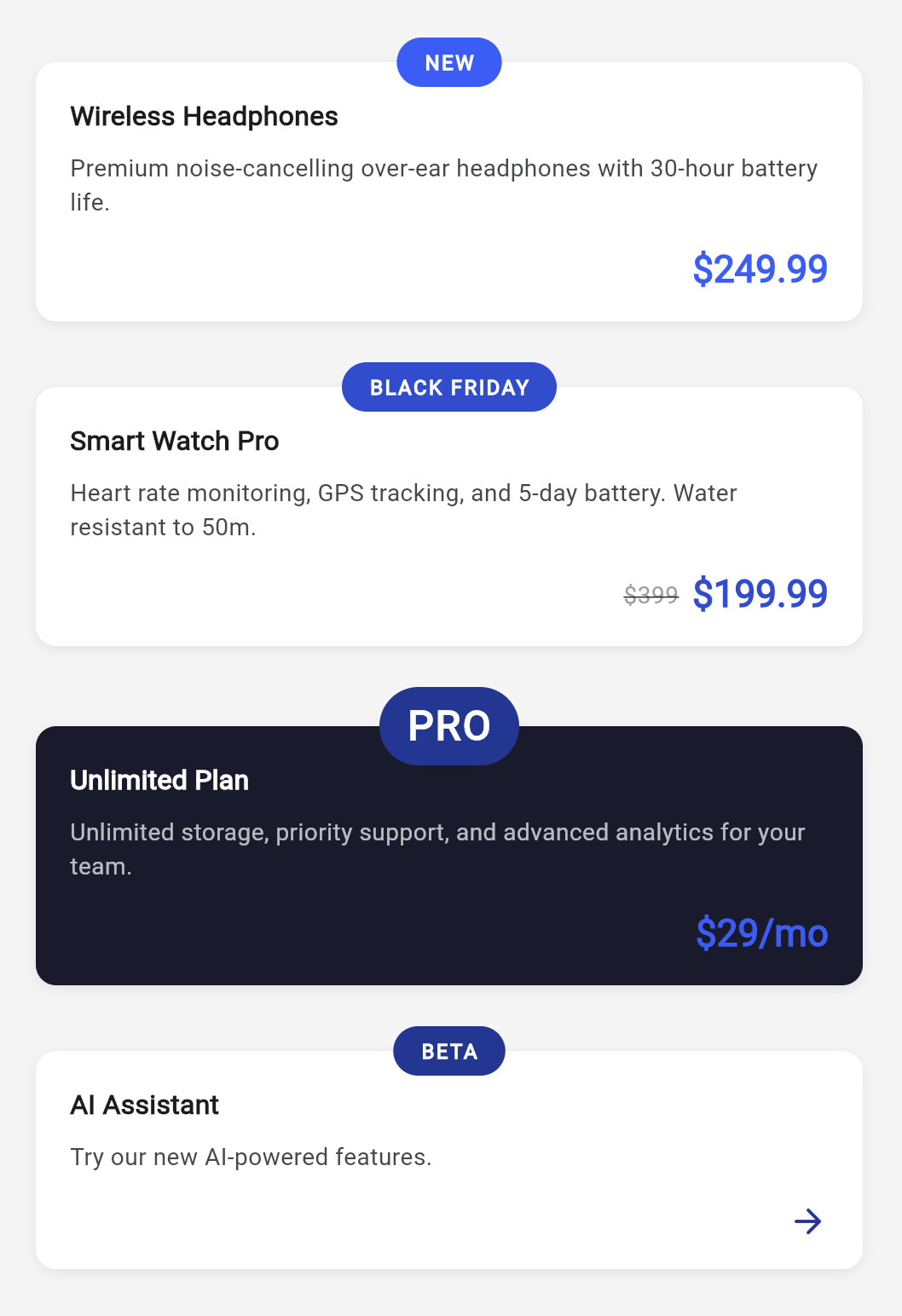
Different tag sizes, different body content — the overhang always adapts.
Why not a plain MultiChildRenderObjectWidget?
With MultiChildRenderObjectWidget, children live in an anonymous linked list — you walk firstChild / childAfter with no way to ask for a specific child by name. You could also manage RenderBox? fields yourself and wire up adoptChild, dropChild, attach, detach, visitChildren… but that lifecycle boilerplate grows fast and a single missing override leads to subtle bugs.
SlottedMultiChildRenderObjectWidget gives you named, type-safe childForSlot() accessors while handling all the child management under the hood. Use MultiChildRenderObjectWidget for a variable number of children (lists, flows). Use slots for a fixed, known set of named children — which is most custom components.
MultiChildLayoutDelegate vs SlottedMultiChildRenderObjectWidget
So when should you use which?
Use MultiChildLayoutDelegate when:
- The parent size is already known (e.g., it fills the available space)
- You want a simpler API with less boilerplate
- You don't need custom painting or hit testing
Use SlottedMultiChildRenderObjectWidget when:
- The parent size depends on children sizes
- You need custom painting or hit testing
- You want type-safe slot-based child access
- You need finer control over the layout protocol
A few tips
A couple of things I learned from using SlottedMultiChildRenderObjectWidget in production:
Don't forget parentUsesSize: true. When you call child.layout(constraints, parentUsesSize: true), you're telling the framework that you're reading the child's size. Without it, the framework may optimize away relayout passes you actually need.
Slots can be nullable. If a slot returns null from childForSlot, there's simply no child for that slot. The childForSlot method on the render object will return null too — handle it gracefully with null-aware operators.
You still need to implement paint and hitTestChildren. Unlike the delegate approach where the framework handles painting, here you're in full control. The good news is that for most layouts, the implementation is straightforward — just iterate over children and apply their offsets.
So?
MultiChildLayoutDelegate is the tool most Flutter developers reach for when they need a custom layout — and rightfully so. It's simpler and covers a lot of ground.
But the moment you need the parent to size itself based on its children, it hits a wall. That's where SlottedMultiChildRenderObjectWidget steps in. Yes, it's more verbose. Yes, you're writing a render object. But it gives you the full power of the layout protocol — and sometimes, that's exactly what you need.
And honestly? Once you've written one, the pattern becomes second nature. The boilerplate is predictable, the slots are type-safe, and you get a widget that behaves exactly the way you want.